
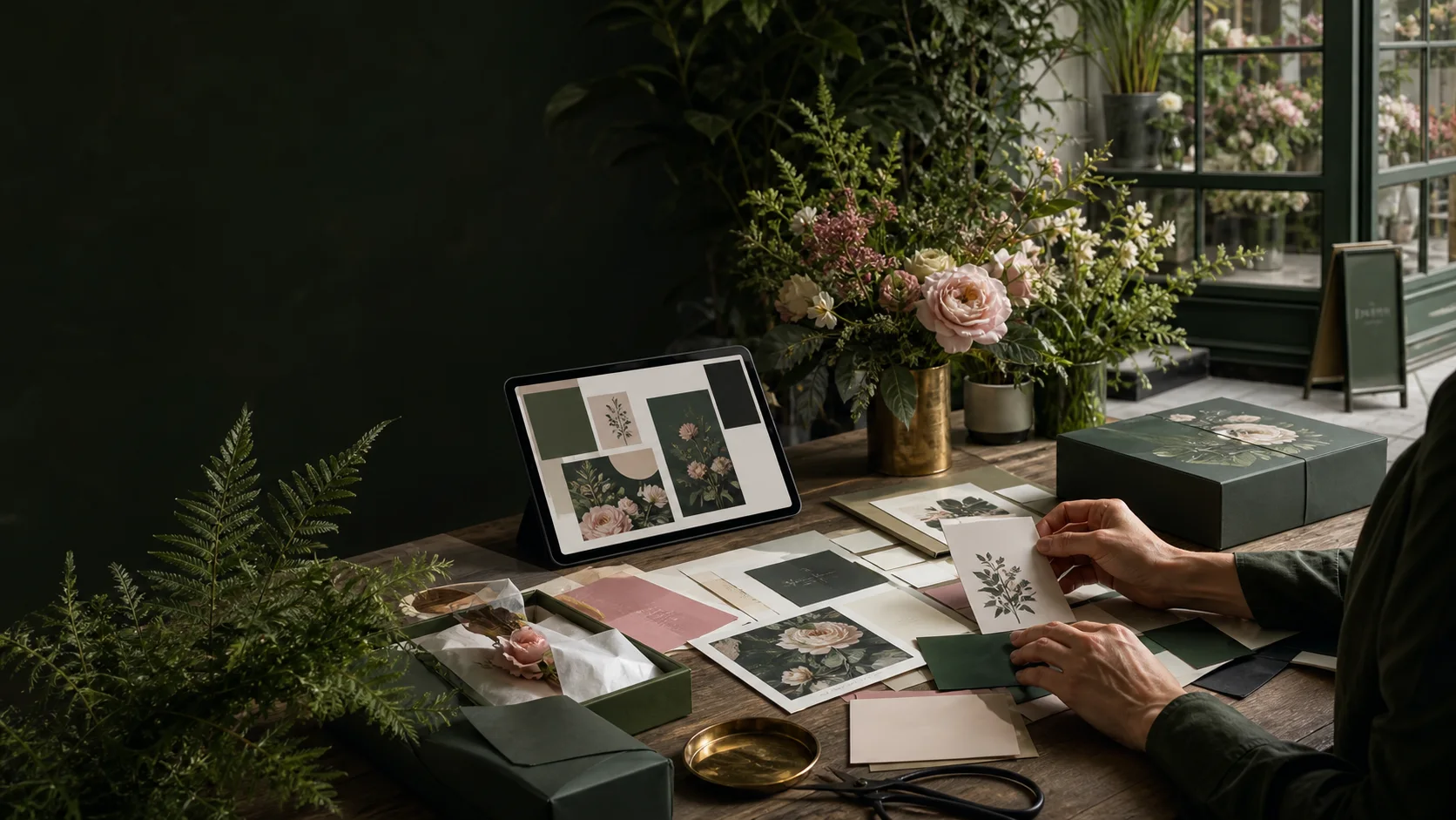
The project story
The brief
The shop had strong taste but inconsistent execution. Florals, gifts, and workshops looked like separate businesses depending on who made the asset and which logo file they found.
The goal was not a precious brand book that sat untouched. The team needed a compact system that could survive packaging labels, social posts, workshop signage, and seasonal promotions.
How we approached it
Strategy before production.
Preserve the organic character
We kept the warmth and botanical personality while removing decorative elements that failed at small sizes or competed with product photography.
Design a family, not one logo
Primary, compact, and emblem treatments give the team appropriate options without inventing a new look for every surface.
Turn taste into rules
Typography, palette ratios, image direction, and spacing examples make the identity repeatable for non-designers.
Production graph
Where the work went.
This is a scope mix, not a client-performance claim.
What shipped
A complete handoff, not loose files.
- Primary and secondary identity marks
- Typography and color system
- Packaging and label direction
- Social and workshop layout examples
- Organized handoff kit with usage rules
Delivery timeline
The engagement arc.
- 01 Visual inventory
- 02 Identity exploration
- 03 Application testing
- 04 Guideline kit and handoff
The outcome
What changed after delivery.
The refreshed system feels premium without losing the handmade quality customers associate with the shop. Product lines can flex independently while still looking like they belong together.
Most importantly, the team can produce everyday assets without starting from a blank canvas or diluting the brand.
A useful identity is not just recognizable. It helps a busy team make good decisions faster.